Adaptive Athletics Association
Softwares: Illustrator, Photoshop
The Project
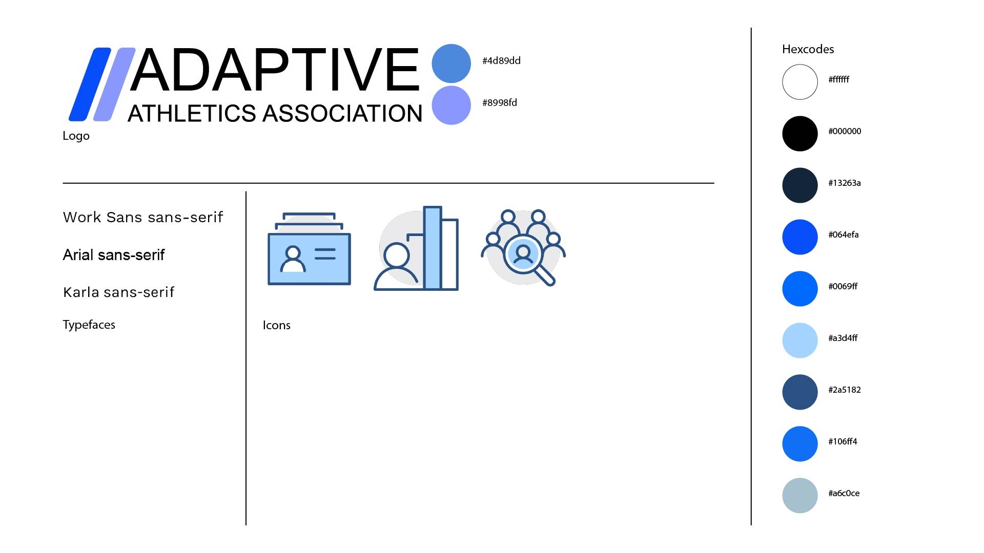
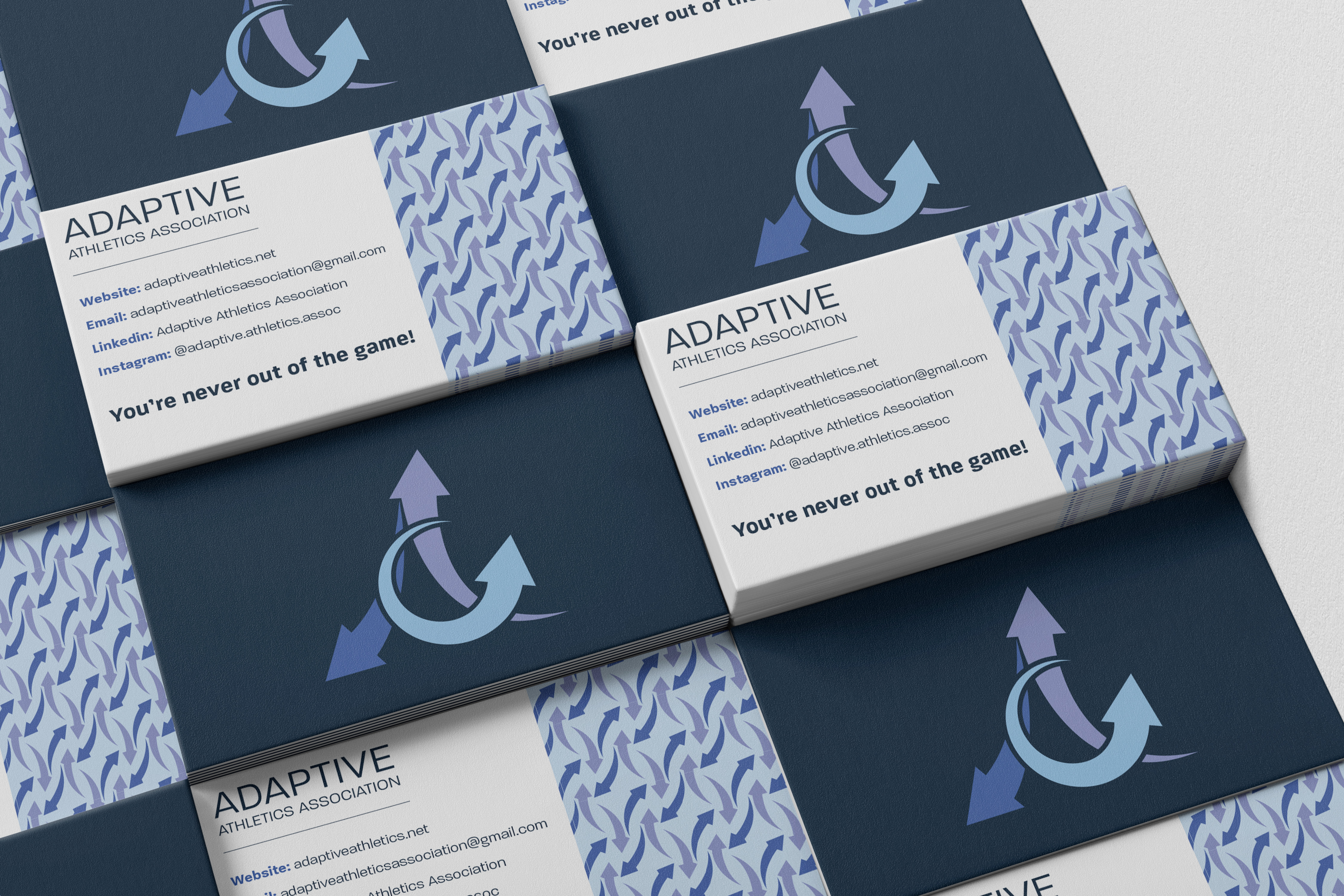
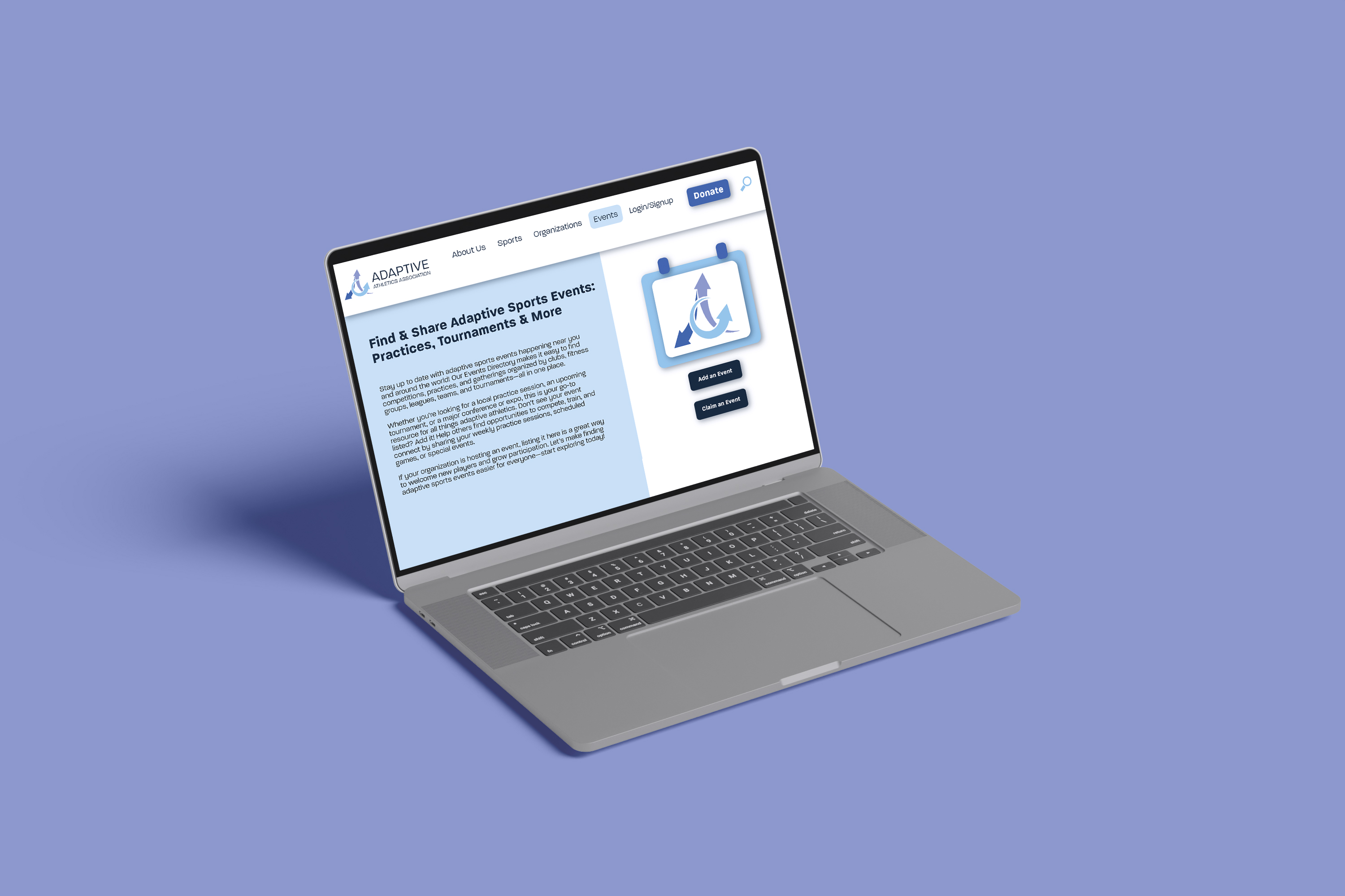
When i began working with The Adaptive Athletics Association, they made it clear that they wanted to start a rebranding project, anything that we could change, they wanted updated. My first plan of action was to update their logo and brand identity to fit their identity. The original logo was very simple, but did not convey the story that Adaptive Athletics wanted to tell.
Research and Process
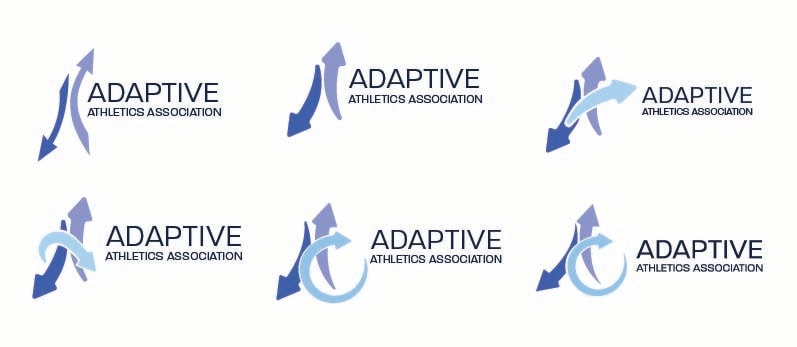
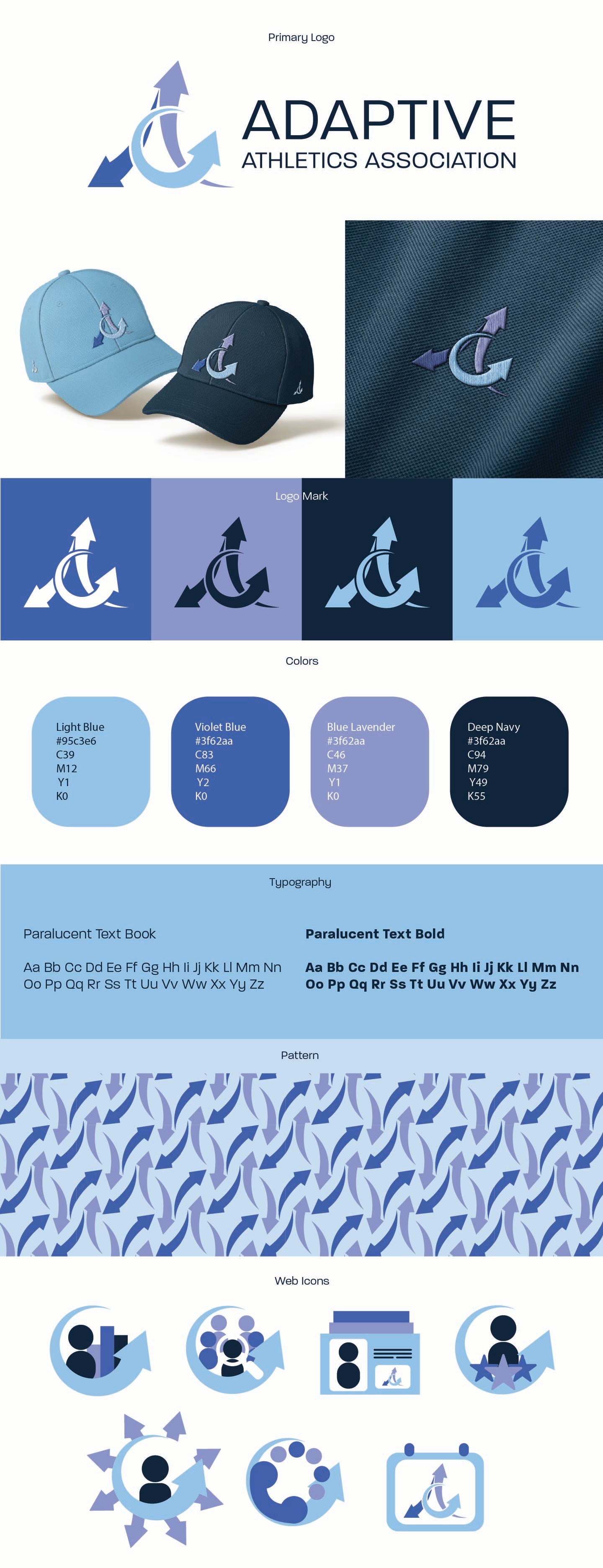
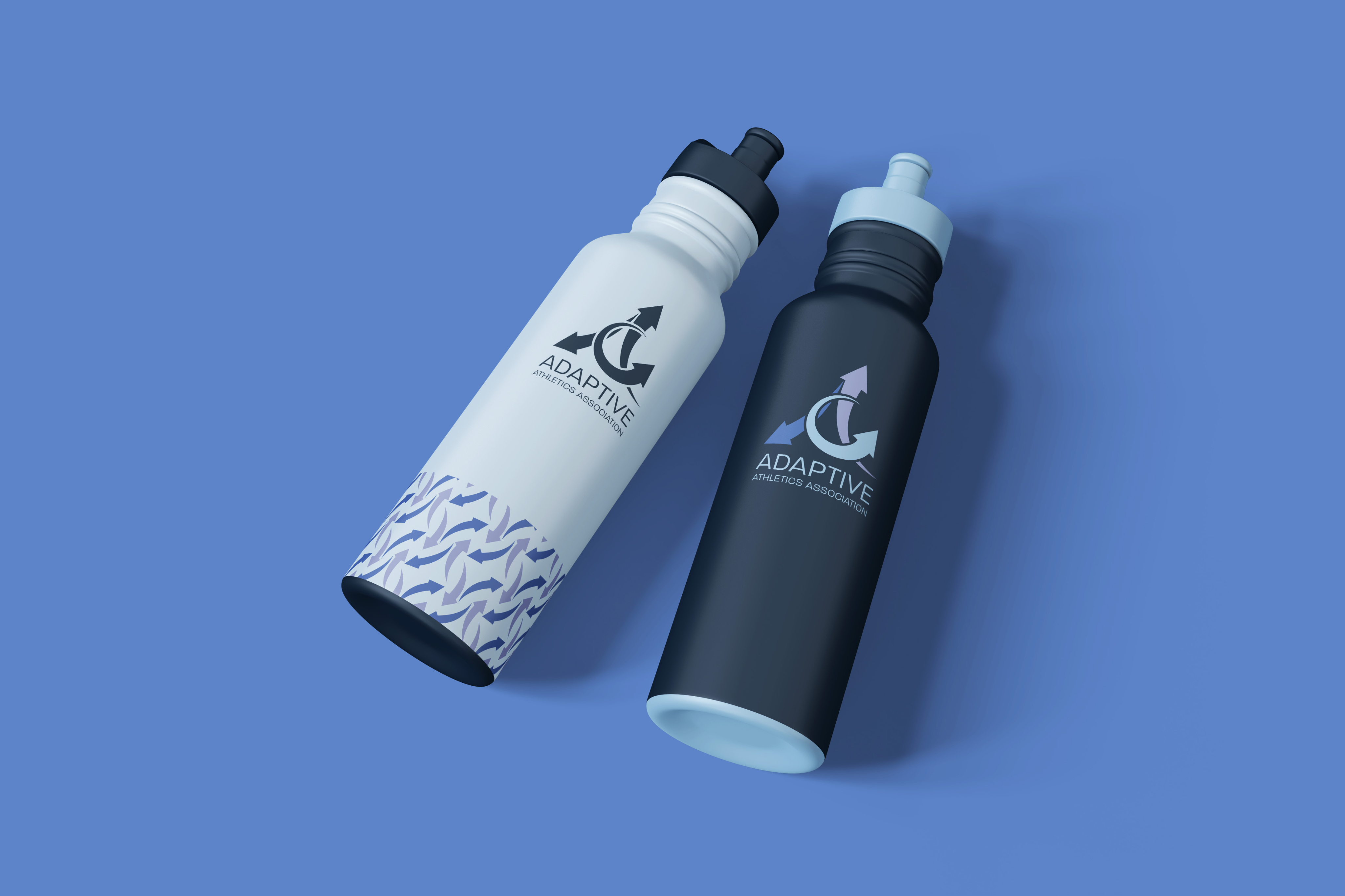
I started by researching the types of imagery that comes up when image searching key words like “Adaptation” “Sports” and “Athletics”. I ended up coming across arrow images and decided to use that as a basis for the logo. The arrows represent adapting and moving forward, both very important aspects of adaptive sports. My goal was to turn the arrows into an “A” shape. It went through many iterations until we landed on the final logo.
For the colors, I took the original palette and adjusted the hues slightly and added the light blue for the third arrow. I also made the decision to start using a deep navy blue for the type instead of the original black to tie the text into the blues of the logo. I also changed the typefaces to the Paralucent text family instead of Arial text as the main typeface.